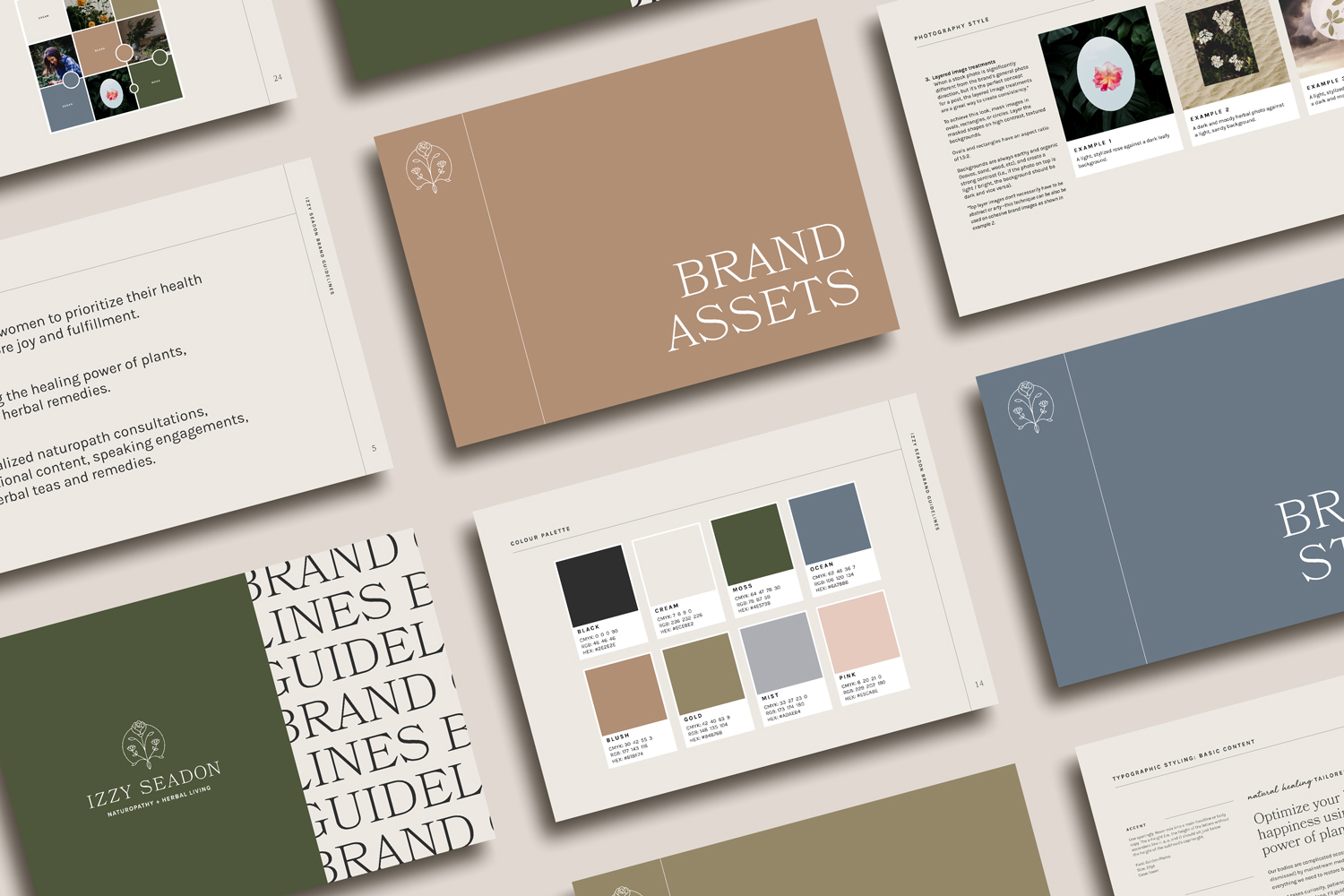
Brand consistency is essential for building trust and recognition with your dream clients. Let’s talk about why it’s so hard to achieve and how to fix it.
Telltale sign you’re struggling with brand consistency:
Spiralling in Canva at 10:47 p.m., thinking: Maybe if I just add a little terracotta here… maybe a more playful font… maybe that retro vibe everyone’s using on Instagram?
Before you know it, you’ve Frankensteined your brand into a mash-up of moods. Your Instagram grid looks like it’s having an identity crisis, your website feels like it belongs to a different business, and your business cards? Honestly, you’re avoiding giving them out because they no longer feel like you.
If you’ve been here, you’re not alone.
This tug-of-war between wanting to stay on brand while feeling restless and ready for a makeover is so normal. But here’s the truth: brand consistency will always feel impossible when your design assets weren’t built to reflect who you really are and where you’re going.
Let’s lift the veil on what’s really happening.
1. Your brand isn’t robust enough
Here’s some tough love: if your brand was built from a pre-made template or a budget design package (no shade), it was likely designed to get you started—not to scale.
Most starter kits cover the bare minimum:
- One logo
- A couple predictable colours for your industry
- Maybe two fonts if you’re lucky
This is honestly a great start for the early days of your business. But as you grow, you’re going to need more tools to tell your story in a way that feels rich and layered. Think:
- Custom icons
- Textures and patterns
- Strategic photo treatments
- Flexible layouts and typography choices
When your brand lacks these, you start reaching for random additions just to keep things interesting. (Hello, shiny object syndrome.) The result? A visual identity that feels scattered rather than seamless.
2. You don’t have brand guidelines
Another symptom of the starter brand package is that they rarely include brand guidelines. And if they do? It’s usually the design equivalent of IKEA instructions without the helpful diagrams.
Detailed brand guidelines are crucial for creating brand consistency. They’re your playbook for how to use every element of your brand with intention. We’re talking:
- Dos and don’ts for colour, fonts, and logos
- Clear guidance on how to style typography (not just what fonts to use)
- Rules of the road for visuals and messaging
- A reminder of your brand’s core values and key messages
With a solid guide, you don’t have to guess or second-guess. Decision-making becomes lightning fast, and you stop diluting your brand with trends that get tired fast.
3. Your brand is too detailed
Here’s my hot take: maximalist brands are gorgeous… when you have a pro designer on retainer to keep it tight.
But if you’re a small business owner without daily design support, an overly detailed brand can turn into a design disaster zone.
- You’ll experience decision fatigue every time you create content.
- You’ll start ignoring parts of your brand kit because it’s just too much to manage.
- You’ll feel cluttered and chaotic every time you open your design files.
And let’s not forget: visual clutter creates energetic clutter. Confusion blocks conversions. Simplicity sells.
Minimalist doesn’t mean boring—it means intentional. Especially for solo entrepreneurs, a cleaner, more focused brand makes it way easier to create brand consistency (and enjoy the process).
4. You don’t have a strategy
If your design assets aren’t anchored in your business goals and values, brand consistency will always feel slippery.
Here’s the thing: when you don’t know why your brand looks the way it does, you’ll be easily swayed by trends and comparison traps.
At Moonstone, we love to ask: How do you want your clients to feel when they engage with your brand?
If it’s safe and calm? We build with muted colours, soft textures, and welcoming layouts. If it’s energized and excited? Expect playful illustrations, movement, and dynamic layouts that spark curiosity.
Design rooted in strategy is like having a compass. Even when shiny new trends try to tempt you off-course, you’ll feel confident staying true to your original direction.
5. You haven’t factored in your unique energetic signature
Here’s where it gets extra Moonstone ✨
Your brand isn’t just a visual representation of your business—it’s an extension of you.
When your visuals reflect your natural energy, brand consistency feels natural.
This is why we infuse astrology into our design process. By studying your natal chart, we’re able to curate visual themes that actually mirror the experience of working with you.
Because when your visuals feel like they fit you as perfectly as your favourite outfit, brand consistency isn’t a chore. It feels natural.
Your brand was written in the stars
If you’re ready for a brand that’s so you that consistency feels as natural as applying your favourite lipstick, our astrology-backed Moonstone Method™ is for you.
Click here to learn more about what it’s like to work with us and book your free call.
