


Let’s talk about what to do when your brand colour palette makes sense but it doesn’t feel right
But first, let me take you back to the original Moonstone brand colour palette.
I built it around the actual gemstone: luminous with soft pinks and electric blues.
Those colours were pulled straight from the polished stone—a visual metaphor for intuition, wisdom, and new beginnings.
Beautiful? Yes. Smart? Totally.
But every time I tried to design with it, something felt… off.
It was the blue. Not my go-to colour. Not my most flattering shade. The palette made logical sense for the name. But it didn’t feel like me.
As a result, I:
- Felt insecure about a bunch of my brand photos
- Wasted time obsessing over how to make it work
- Ghosted my marketing and likely stunted the growth of my business in the process
Basically, I kept forcing it to feel right and it never did.

It wasn’t until I planned my wedding that I finally figured it out.
If you’re married you know—you pick a colour palette for your wedding that makes you feel like your most beautiful, confident, radiant self. It should surprise absolutely nobody that there wasn’t a trace of electric blue in my wedding palette.
The colours that felt radiant and complementary for me were warm, muted earth tones. And I realized: this is what my brand colour palette was missing.

Allow me to (lovingly) call you out on your colour mistakes
Unless you’re a designer or artist, I’m guessing you didn’t major in colour theory. That knowledge gap—plus a little too much DIY—almost always leads to one of these:
- Choosing too many colours
This leads to loud, hectic marketing that’s hard to use and harder to look at - Choosing too few colours
This leads to boring, repetitive marketing that blends into the scroll - Choosing the wrong balance
ALL bright and loud, ALL dark with minimal contrast, or so much pop that nothing stands out - Changing your colours with the seasons instead of a strategy
This can work for product-based businesses—but for service providers? You need a core palette people can count on you for - Changing your colours with your mood
I get it. I’m moody too. But let’s take it out on a pint of ice cream and not our brands, yeah? - Having a gorgeous palette but not knowing how to use it
For example, pairing vibrating neons or low-contrast tones that get lost on screen
And that’s not even getting into concepts like:
- Your seasonal skin tone palette
This mismatch was the root problem in my case of the blues - How colour shifts depending on scale
A little swipe of sage is very different from a full-bleed green background
Long story short: colour is super important and also super complicated.
The problem with picking colours by vibe alone
Without a deeper strategy, most colour palettes fall apart within months. You get tired of them. You start randomly changing tones to “freshen things up.”
The result? A scattered visual presence that:
- lacks consistency across platforms
- makes it harder for people to recognize and remember you
- subtly signals amateur hour—even if your offers are 🔥
Meanwhile, colour done right? It’s the quickest way to make the best first impression. It catches the eye, builds recognition, and tells your audience what it’s like to work with you before you even say a word.
Choosing a brand colour palette that actually works, the Moonstone way
Want a brand colour palette that lasts? That attracts the right clients and reflects the real you? Here’s how we generally approach it at Moonstone these days (and how I wish I’d done it the first time around):
Start with your rising sign
Your rising sign is your brand’s first impression. It’s how people feel your energy when they land on your homepage or scroll your Instagram.
Each rising sign carries a different aesthetic tone. Here’s how this might show up:
- ♏ Scorpio rising → moody, rich, mysterious. Your palette needs depth.
- ♎ Libra rising → we’re finding that perfect soft girl balance—not too bold, not too neutral.
- ♊ Gemini rising → your brand craves playful, energetic pops of spring. (Just keep it cohesive.)
But this isn’t pop culture astrological-meme branding. You won’t walk away with the same palette as every other Scorpio rising mystic.
In addition to that, we consider your:
- Natal chart ruler (the planet that rules your rising sign)
- Business model
- Dream clients
- Offers
- Values and beliefs
- Vibe you want to become known for
When you put the whole puzzle together, we land on a brand colour palette you can actually stick to.
How many colours should you include in your brand colour palette?
In my opinion, less is more. A broader colour palette can feel more versatile and fun. But it often leads to overwhelm and a scattered look when it’s not used with tremendous care.
Bottom line? You don’t need 12 colours. Just a simple system.
More colours ≠ more flexibility
More colours = more confusion
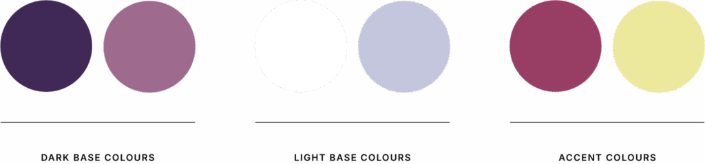
A simple brand palette formula
- One or two dark base colours
- One or two light base colours
- One or two accent colours
That’s it. Anything more becomes hard to use. And harder to remember.
Why this matters more than you think
Imagine this:
You open your design file and you’re not staring into the void. Instead, you know:
- exactly what colour your buttons should be.
- what shade your headlines need to be.
- how not to use colours so they don’t dilute your vibe.
And the best part?
Your audience starts to recognize your posts before they see your handle.
They pause, feel something, and know it’s you.
That’s not a happy accident.
That’s strategy—backed by the stars.
TL;DR:
→ You don’t need another Canva template
→ You need brand clarity rooted in who you are
→ And you can find that in your chart
Ready to fall in love with your brand colour palette once and for all?
If you’re thinking, “This is exactly what I need,” I’d love to help you translate your birth chart into your entire brand design design in a way that feels aligned with your true aesthetic and your business goals.
I offer free, no-strings-attached calls where you can ask your specific questions about the Brand Star Chart, see if it’s the right fit for your biz, and walk away with real clarity about your next best step.
Click here to book a free call
Let’s see what the stars (and your brand) have to say.

